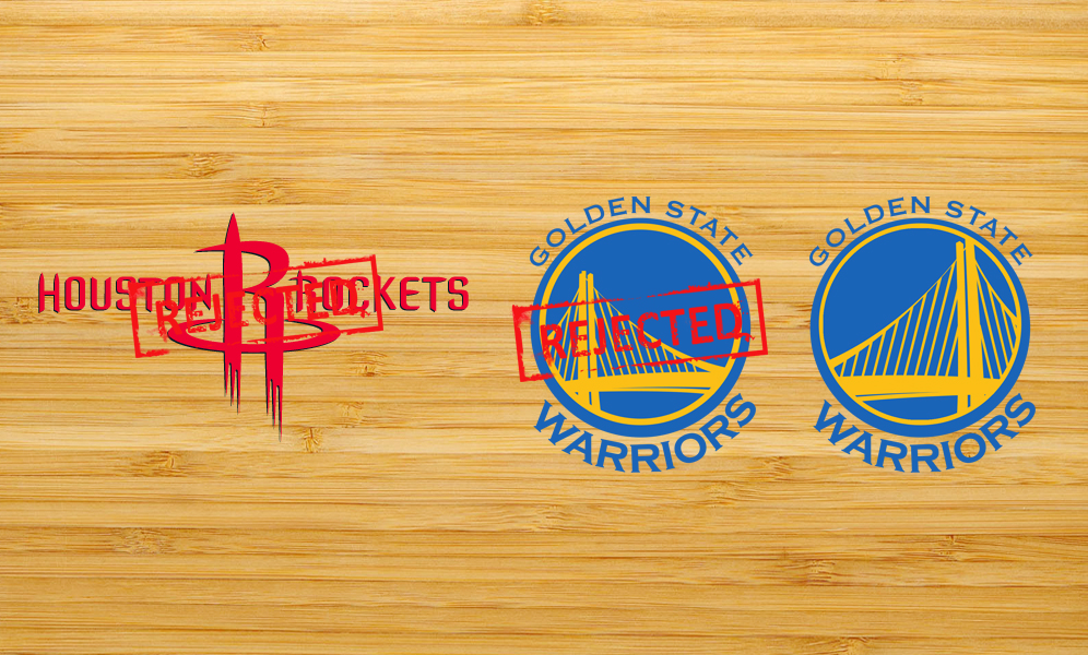
We’re watching the clash of two bizarre or inexcusable brands of the NBA. The Warriors and the Rockets. The Golden State logo is not bad, don’t get me wrong, but I can not understand why they didn’t use the bridge ‘upwards’. The line that represent one of the Golden Gate’s cable is going down, instead of up. That’s terrible analogy in logo symbology. Represent descent, decay, instead of the opposite. Good thing for the fans the team is doing the opposite. But I still make my case.
The Houston Rockets already changed its visual identities a few times in the recent years, maybe it’s the team that changed most in the past couple decades. The current one is not only odd if you compare to the other ones, in the NBA or out, in the other leagues, but it’s so weird. Every time I watch a game in their arena, it feels like somebody wrote those things on the floor with blood! The logo and the lettering seem to me like the title of a horror movie or series. In my opinion, it is the worst visual identity in basketball. The Rockets are a great franchise, the team has a history and the fans are amazing, but, something has to be quickly fixed there.