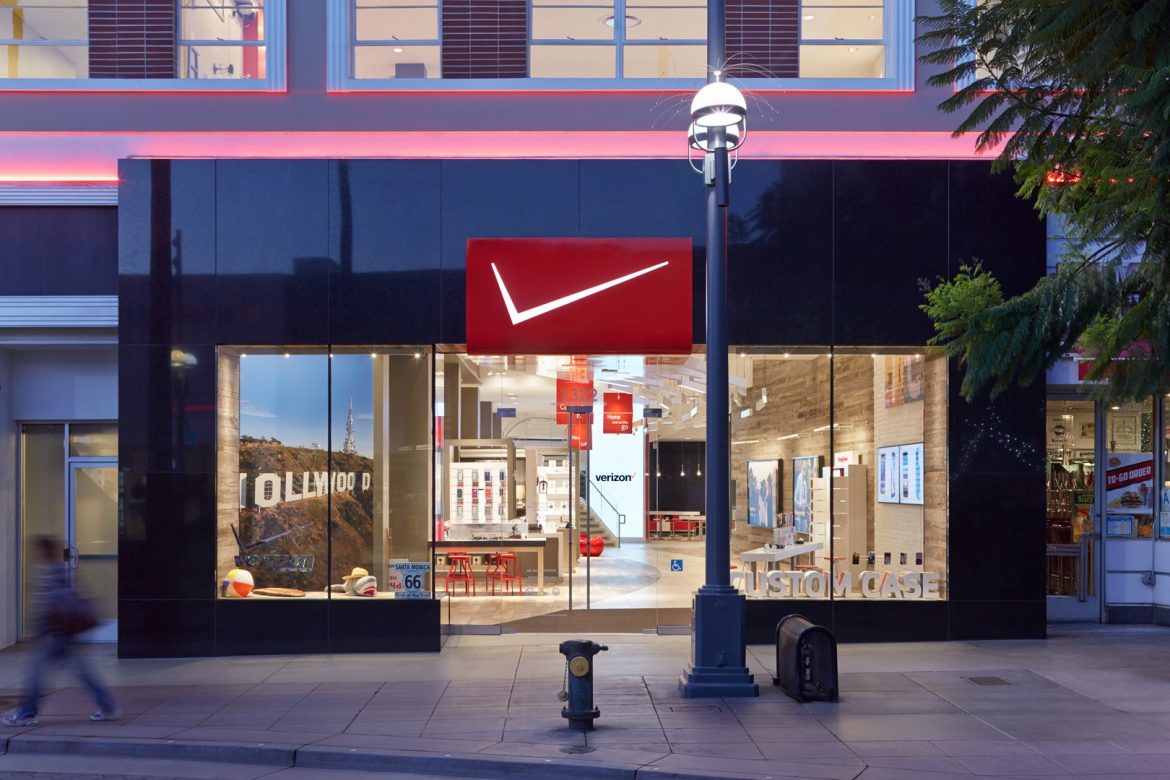
I would like you to see this image of the recently opened Verizon Destination Store in Santa Monica, California (above).
The carrier decided to cut things to the chase, making its logo minimal, using only the V on the top. Not mentioning the name or anything else, just the V.
Can someone tell Verizon this is not its visual stamp?
Verizon’s core resides on its bold, and now traditional lettering. Maybe with the bolder Z across. And that’s it!
My last question: Are you going there to get a new phone or a new pair of snickers? For me, it is just a Nike shop that went really, really bizarre.